Table Masters
Brand Visual Identity

Overview
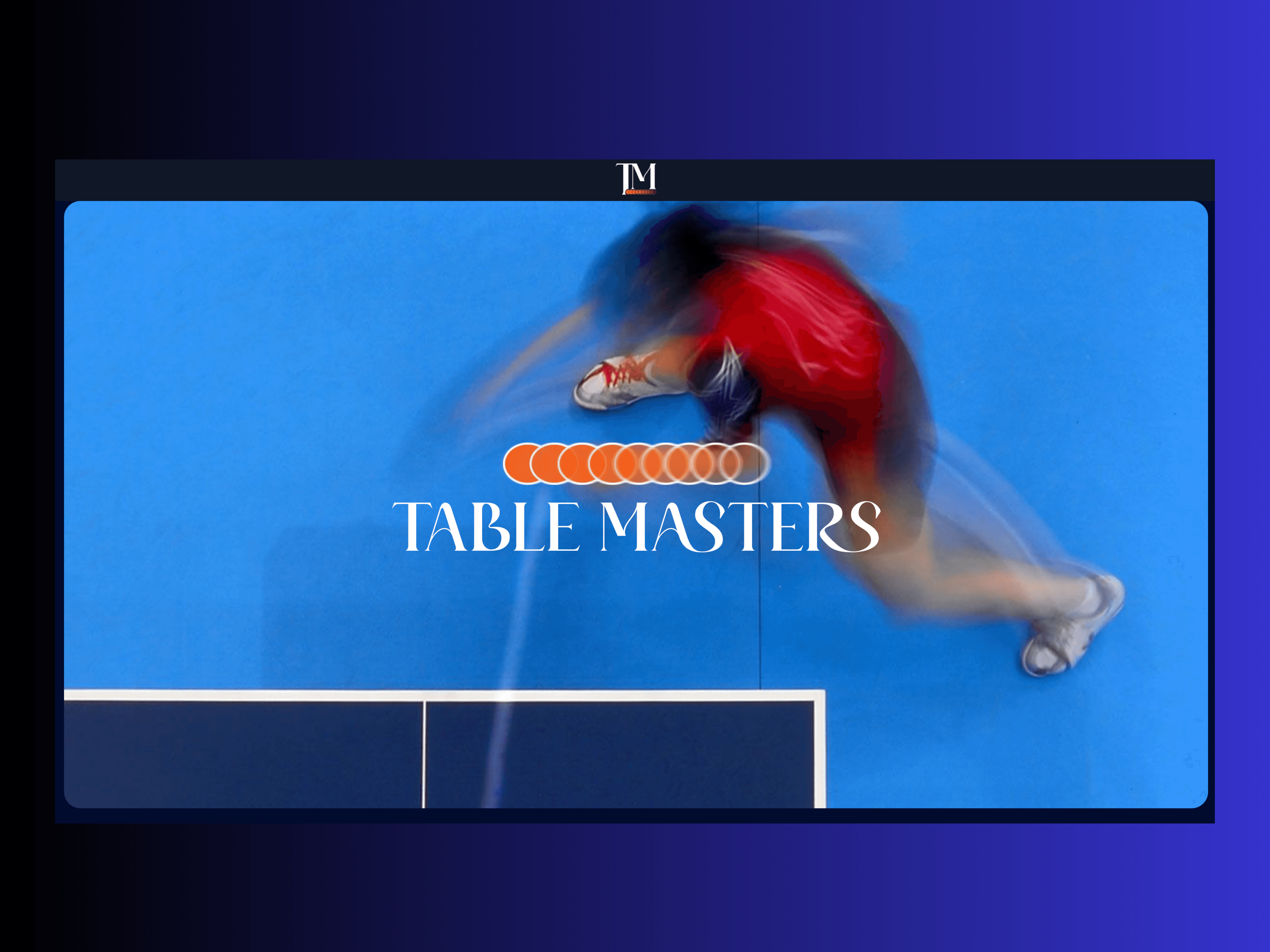
My employer gave me the challenge of creating a brand guideline based off something random in which I was given a ping -pong. It was with quick thinking I decided to challenge myself in making the sport appear on the same level as tennis. Thus the idea of Table Masters was born to make the sport visually engaging, vibrant and classy.
Client:
n/a
Year:
2025
Category:
UI/UX Design
/
Web App
Location:
Kingston,Jamaica
The Challenge
As my first attempt at building a brand guideline, I faced the challenge of translating the fast-paced and playful nature of ping pong into a cohesive visual identity. The difficulty lay in balancing energy with sophistication while ensuring the brand felt unique and memorable.
The Solution
Drawing inspiration from Wimbledon’s long-standing tradition of curating an iconic visual presence, I reimagined the ping pong brand through a similar approach. I designed a guideline that brought together carefully selected imagery, fonts, logo concepts, and a distinctive color palette. This curated collection was built to communicate both the competitive spirit and the elegance of the game.


The Result
The result was a polished mini brand guideline that elevated the sport into a more aspirational space. By defining its visual direction, the brand now has a foundation that captures personality, energy, and timeless appeal. Meet my mini idea of TABLE MASTERS.